Thursday, November 27, 2014

CTNX 2014 - Sketches of CTN

This year was my first experience of the Creative Talent Network (CTN) conference in Burbank, CA. It was truly one of the most inspiring events I've ever been to - I've never been so surrounded by amazing artists and animators. I met so many wonderful people, and saw a few old friends I didn't expect to run into, so all told it was a really lovely 4 days. Fairly sad that it's over but I will DEFINITELY be going back next year!

I present for your amusement some of the sketches I did during those four days - most were done using my favorite "lurk in a corner and people-watch" technique, at a nearby cafe or elsewhere around the event. There were also some amazing costumed models that were stationed at a few places around the convention hall for hours at a time; some of the best figure models I've ever had the chance to draw. Still others of these were the result of the random need to doodle. It's been rare lately that I've been able to draw just for fun for such a sustained amount of time. The experience was really good for the soul, and I intend to keep it up!

Random doodles and some people waiting for their coffee

More cafe people. Also, I did the top bird after seeing a character design talk that involved drawing over an inkstain - I used the general shape of the inkstain as inspiration. Then I drew the other existential-crisis bird to accompany.

People around the convention hall. Also owls

Some sketches of the awesome costumed figure models - on this day they donned western getups.

Some more of the figure models, and also more coffee-people. I spent a lot of time at Starbucks.

During my layover at SFO airport on the way home. Also at another Starbucks once I got back to Seattle. I drink a lot of coffee.
Hope to post many more random sketches! Will hold myself to it!

Tuesday, October 28, 2014

Riot/Polycount Art Competition - Arcade Nocturne

Decided to give this competition a go! I love the aesthetic of League of Legends and just recently finally had a chance to try out the game, so why not? Choosing Nocturne as my subject champion - haven't had a chance to play him yet but he seems awesome. I love the arcade skins especially, which is a completely different aesthetic from what I normally do for character art, so thought it would be a fun challenge.

I noticed that the other existing arcade skins tend to be inspired by elements from specific games/themes, so for my idea here I'm going for a look inspired by a mashup of Tron/Daft Punk aesthetic, the Rocketeer, and a bit of the Pac Man ghost. Having an interesting time with the color palette so will see how that evolves, but overall I'm just having fun doing something different!

Will keep updating this post as I go and also link my WIP threads on the Polycount forum - I'm going to try and do both an entry for the Illustration and Character Art categories with this guy!


10/28 first sketches of ideas. Hope to hone in on a more final design soon so I can get cracking! There are elements of all of these that I like. 

Wednesday, October 1, 2014

MONSTER MONTH & Inktober challenge page!

Happy October! I'm going to maintain this post for a couple of awesome October art challenges I'll be participating in, so I can have everything in one place. Inktober! And an awesome Monster Month! Perfect for the Halloween season. I will probably combine several of my entries for both.

10/17/2014: Lantern Ghost

Little ghosty dude today. I gouached! 


10/16/2014: Ballpoint Banshee
Love working with ballpoint pens too. This challenge has been great for really just allowing myself to draw for fun and without pressure. 

10/15/2014: Spider Zombie
Definitely Skulltulla inspired. Actually tried to combine some of the elements I found most creepy about Skulltullas and ReDeads.

10/14/2014: BatBird
I...I don't even know. Whatever it is, it's a baby!

10/13/2014: Skele-creeper

Skeleton-devil creature


10/11/2014: Creeper
Some kinda creepy...thing. 


10/8/2014: It's the GREAT PUMPKIN!
Yeah yeah so I already did a pumpkin. Inspired to do this one after seeing a rotten pumpkin in the neighborhood - they start to look all wrinkly and cool

10/7/2014: CAT
Rediscovered a giant box of copic & micron pens in my house and decided to start trying them out again


10/6/2014: BAT CREATURE
Playing around again with ink and water

10/2/2014: SPIDER PUMPKIN!
Messing around with inks n' stuffs on terrible paper

10/1/2014: WRAITH

Scribbly wraith sketch experiment with wetting an ink drawing


San Diego Zoo sketches!

Last week while visiting family in CA, I got to spend a few hours at the amazing San Diego Zoo. The place is huge! We barely made it through 1/3 of the place. Next time I'll have to make a visit to the wild animal park, too, haven't been in years.

ANYWHO, I thought I'd share some of the sketches that came out of that trip. The first place we stopped was the reptile house so much of the goodness happened there.


Tried to label the animals when I could for later reference - this guy was probably my favorite from the whole trip. 

Some of the snakes were downright adorable
This big orangutan was another favorite. He had this perfectly groomed-looking epic facial hair
He also would sit around and strike crime-boss type poses. Also note the bird with the awesome mohawk and name. I love crazy hairstyles on animals. 
The aviaries were another great section to visit.

Was losing steam at this point, but had to do some of the nutty flamingo poses on the way out. 

Fabulous zoo hat for the occasion. Also note the proper sketching stance - the more uncomfortable it is, the better.  

Zoo sketching is the best! Everyone should go to their nearest zoo and draw everything. We didn't even see half the zoo and I got to sketch some really amazing animals with so much personality.

Happy sketching!

Sunday, September 14, 2014

Seeds of Destruction - thesis character renders finally up!

This will be a short post, but a good one! I finally present to you the Four, of my thesis project Seeds of Destruction:


Additional rendered angles of the characters as well as the original concept illustrations can be seen over on my portfolio website!

Phew. This post has been a long time coming. My original concepts for these guys were very much in a 2D illustrated style, which I wanted to carry through into the 3D models. I ended up experimenting with many techniques to accomplish this. One particular strategy I ended up using to get a more hand painted look in the textures was to, well, hand paint the textures. I actually printed out the UV shells for each character once I had sculpted them in ZBrush and baked some ambient occlusion (so I would have some shading for reference when I started to paint). I printed on a decent card stock, which was the only thing I tried that would both go thru my printer without jamming it, and would also hold up semi-well to watercolors and ink.

Inked lines pass for Famine

Watercolor texture pass for Famine

I did two passes for each character - one to get the brush painted texture and occlusion with watercolors, and another with an ink pen to do some linework to emphasize some features, especially on the faces. I also later combined this hand done linework with Maya's toon line functionality to achieve the final lined quality seen in the rendered images. I found that using the handpainted textures with ramp shaders in Maya best achieved the result I was looking for in 3D, and overall I am quite happy with the result!

Tools used were Maya for modelling and rendering, ZBrush for sculpting, and Photoshop for texturing and editing. Thanks for reading!

Wednesday, September 3, 2014

Concept Art: Seeds of Destruction

Finally getting work from my thesis project up on my portfolio site, so I'll share it here and get a little more into my design process than the description boxes will allow! These are concept images for the characters I created for my MFA thesis project at DigiPen, titled Seeds of Destruction.

The four characters are siblings who have been charged to act as stewards of four powers of destruction: plague, war, famine, and death. Thematically, this obviously was based on the Four Horsemen, but I had wanted in this project to do a different take on them. Their powers are associated with the mantle, both literal and figurative, that they take on when they are charged with their roles, and manifest via the cloaks they wear. Each power is also attuned with various aspects of nature, most especially plants. It was a particularly interesting challenge to me to try to convey powers associated with destruction through plant life, since plants are not usually perceived as being destructive (though they certainly can be, and powerfully so).

This project was also a lot of fun to experiment with stylistically - I had wanted to do a very stylized look, inspired in particular by such games as Okami, Skyward Sword, and Journey. I'll write some more in-depth posts later on detailing some more of my design process, more specific reference I looked at, and more early concepts for these guys. For now, you get the good stuff up front! I am still working on re-rendering the final models of these guys as well, so you'll hopefully get to see that next week.
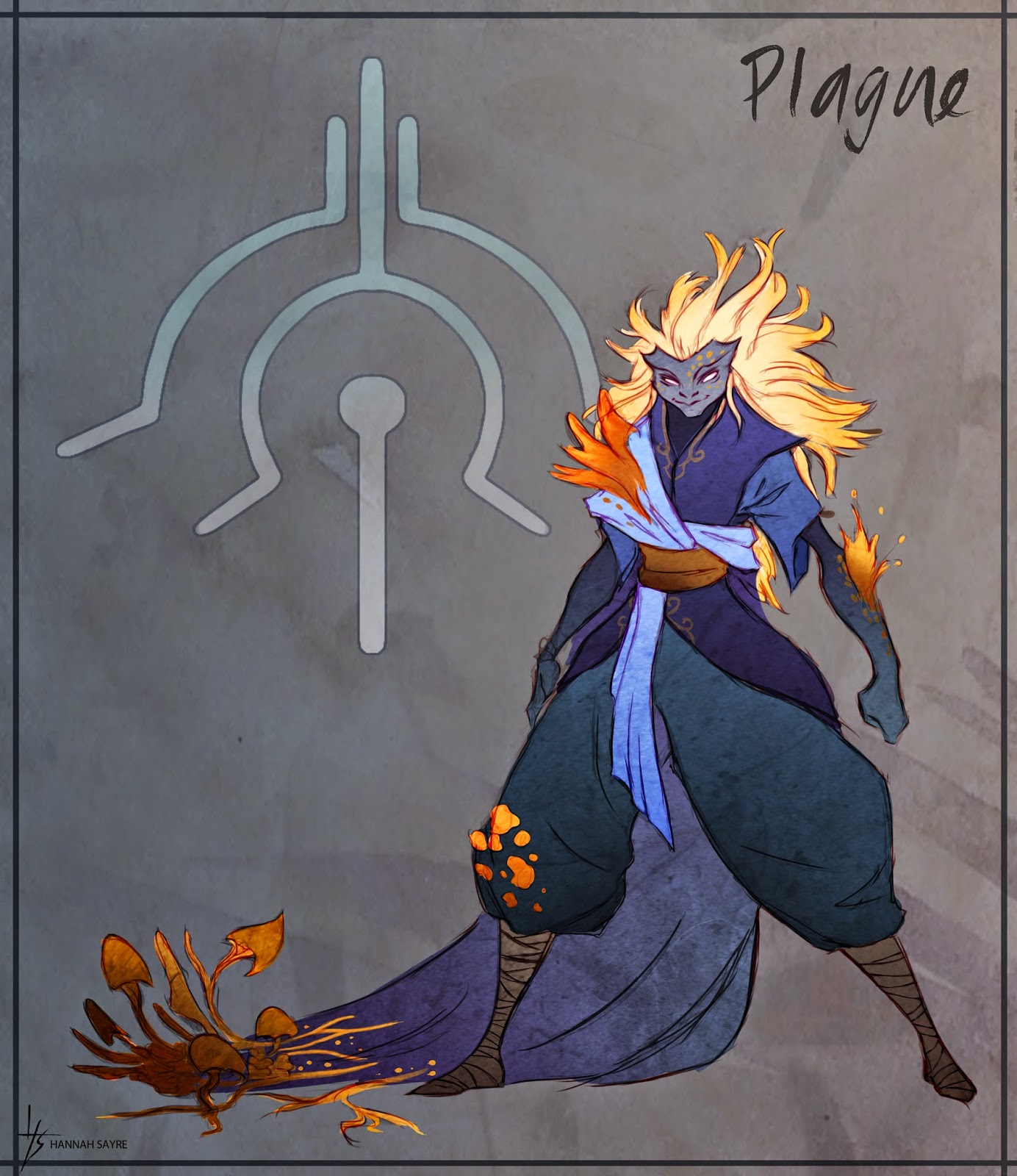


The first character I fully realized was that of Plague - from the beginning I had wanted her to be the biggest, most bombastic personality of the Four. I think this largely ended up being manifested in the size of her hair. She stands the shortest of the siblings, but nonetheless takes up as much - if not more - space. The design of the Plague sigil, seen behind her in the illustration, comes from the symbol of a bow, which is traditionally associated with the first of the four horsemen (who is sometimes known as Plague/Pestilence, but often known as Conquest - i.e. "the bow and crown of conquest"). Traditionally, the first horseman also wears a white cloak; my early designs for all four had much more muted colors, but I found that these did not mesh with the direction I was going and the inspiration I was drawing from, so I ended up choosing a much more vibrant, but limited, color palette for each character. So, Plague became blue. The plant life her powers are associated with is that of fungi and parasitic plants, which I thought worked well thematically with the idea of Pestilence/Plague right from her very early designs.
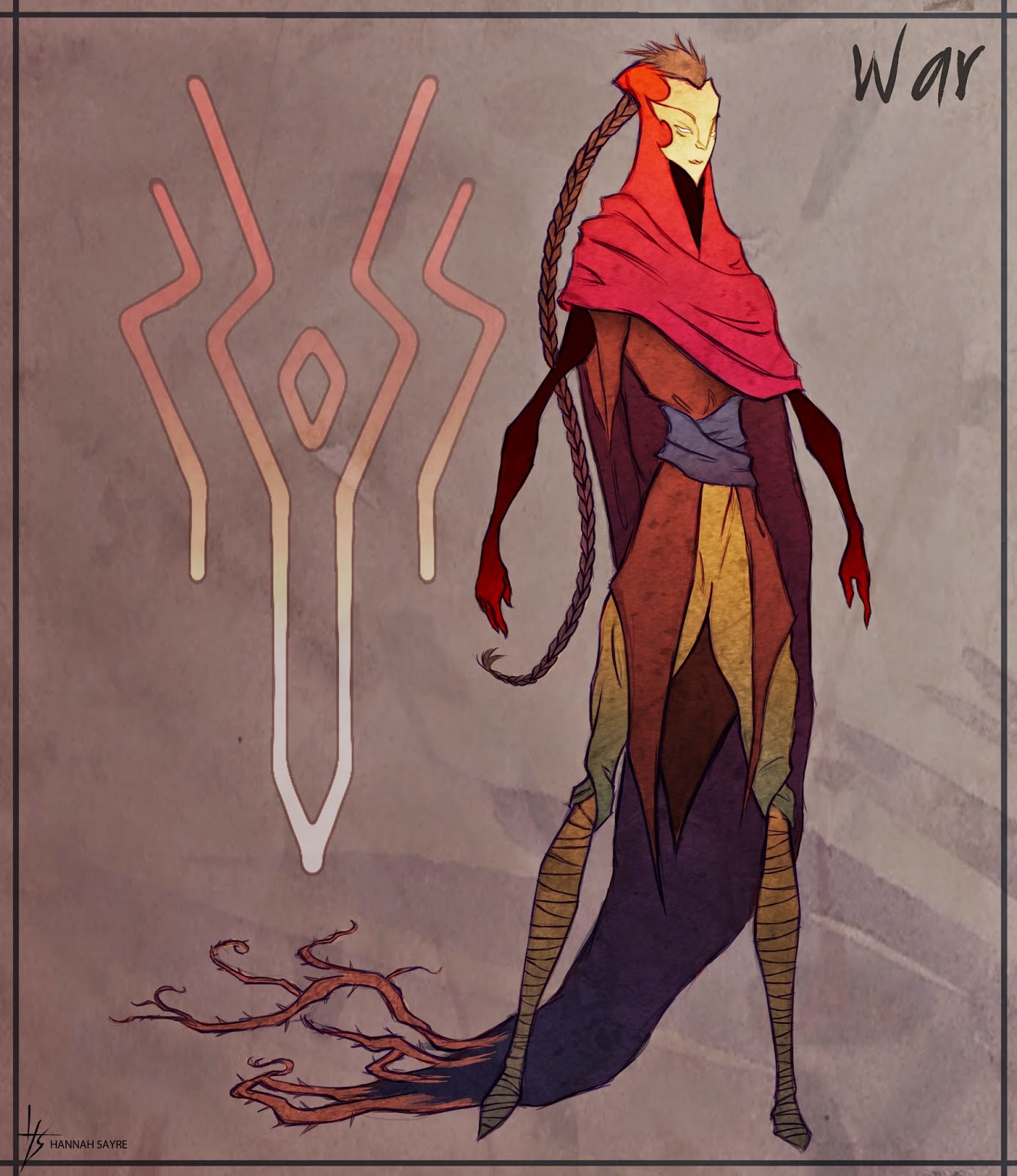


Next up is War, the other of the two sisters. I had a lot of fun playing around with silhouettes for all four characters to try and fit their personalities and themes. For War, I wanted to make her very tall, stoic, and with many sharp points and angles - this was to contrast her with Plague, who has large, round shapes, and takes up a lot of space, and to tie her to her associated plants:  thorny bramble and constricting vines. The War sigil comes from the symbol traditionally associated with the second horseman, the "great sword of war."
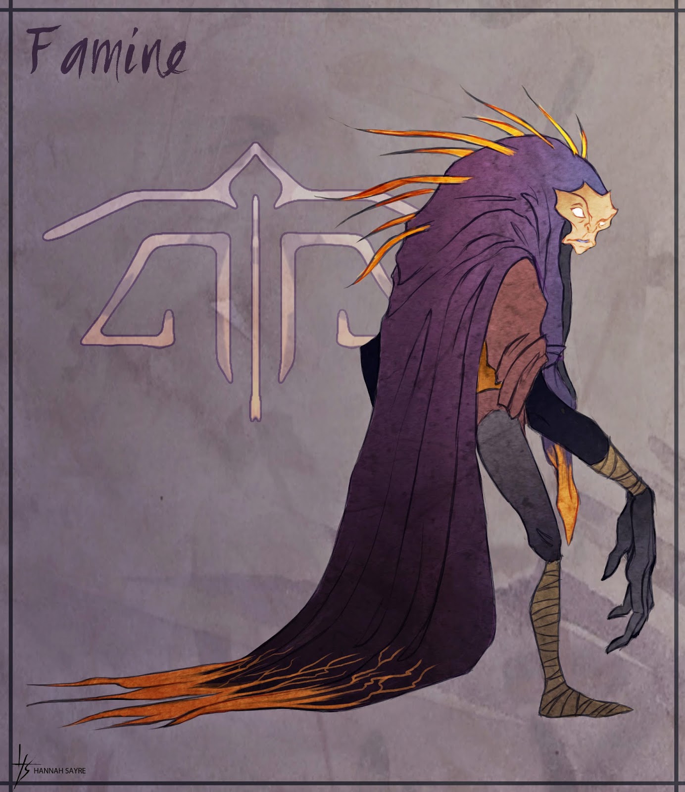


Next, the first of the two brothers: Famine. This guy I always wanted to be a creepy, unbalanced sort of character, so I incorporated the most asymmetry and exaggerated proportions into his design. He is associated with carnivorous plants, so I wanted his silhouette to read as vaguely predatory and menacing, but not overly so. From his early design the character also felt most appealing to me with these large, expressive hands. The Famine sigil design comes from the set of scales traditionally carried by the third horseman, Famine.


Lastly, the oldest of the siblings, Death. I imagined him as being the responsible oldest brother type, keeping everyone else in line, so for his design I used a lot of straight lines and squarish shapes. His was the hardest to fit thematically with a type of plant, but I ultimately found that gnarly old trees fit very well with him. Even rotted old stumps can become nurse logs, old wood will grow moss, etc, so there was this interesting life/death juxtaposition in old wood that appealed to me for the character. The color green, also, can be associated with both putrescence/decay and with life and growth, and I wanted to try to capture some of these dual associations in his design.

You can check out these concept illustrations over on my portfolio website, too! Again, I'll be posting the final images of the models as soon as I finish re-rendering them, and I'll post a bit more about the design process that went into this project later on as well.

Thanks for reading!

Sunday, August 17, 2014

Mini paintings to get things started!

First post! This blog will serve as my sketchbook, a place for all my creative ramblings and adventures. Thanks for visiting!

To get things started, here are a couple of mini paintings done at my grandparents' beachfront home on lovely Whidbey Island. I spent a significant amount of my childhood here, and I associate the place with all things whimsical. The garden is something right out of a Beatrix Potter book, and is one of my favorite places to be at any time of year. Their home, too, is full of little scenes that capture warmth and light, and so while visiting recently I decided to try and sketch a few of them down as quick thumbnails. 


I love the way their dining room looks at night, with a lot of warm woods and warm lights.


This one is of just inside the doorway shown in the next one, leading to the den. Always looks amazing on sunny days.


One part of the garden looking out to the deck, beyond is the beach. I love all the little sanctuary vistas like this one found throughout the garden. 

Doing these was great practice! I've got plenty to learn about painting, but finding spots like these that inspire really motivates my learning. May anyone reading this find some person, place or thing that so inspires them!