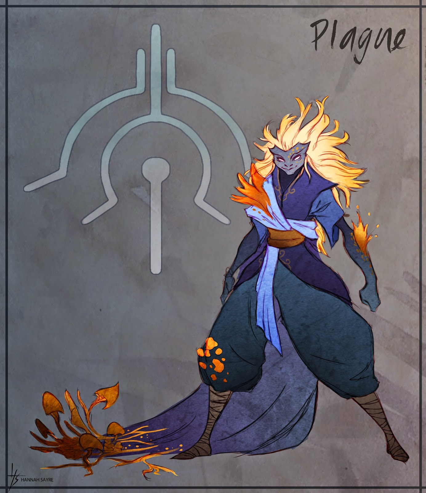
The four characters are siblings who have been charged to act as stewards of four powers of destruction: plague, war, famine, and death. Thematically, this obviously was based on the Four Horsemen, but I had wanted in this project to do a different take on them. Their powers are associated with the mantle, both literal and figurative, that they take on when they are charged with their roles, and manifest via the cloaks they wear. Each power is also attuned with various aspects of nature, most especially plants. It was a particularly interesting challenge to me to try to convey powers associated with destruction through plant life, since plants are not usually perceived as being destructive (though they certainly can be, and powerfully so).
This project was also a lot of fun to experiment with stylistically - I had wanted to do a very stylized look, inspired in particular by such games as Okami, Skyward Sword, and Journey. I'll write some more in-depth posts later on detailing some more of my design process, more specific reference I looked at, and more early concepts for these guys. For now, you get the good stuff up front! I am still working on re-rendering the final models of these guys as well, so you'll hopefully get to see that next week.
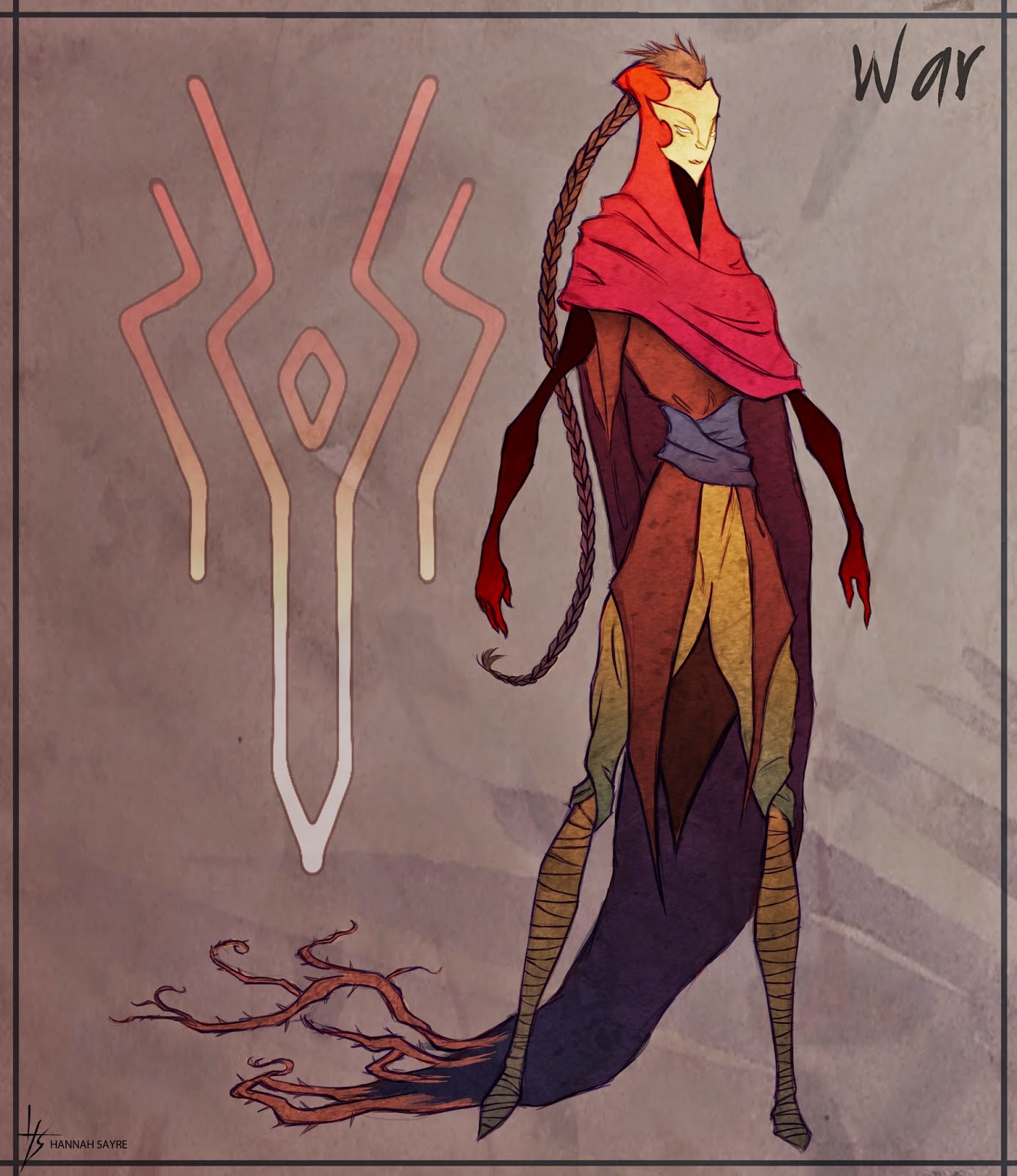
Next up is War, the other of the two sisters. I had a lot of fun playing around with silhouettes for all four characters to try and fit their personalities and themes. For War, I wanted to make her very tall, stoic, and with many sharp points and angles - this was to contrast her with Plague, who has large, round shapes, and takes up a lot of space, and to tie her to her associated plants: thorny bramble and constricting vines. The War sigil comes from the symbol traditionally associated with the second horseman, the "great sword of war."
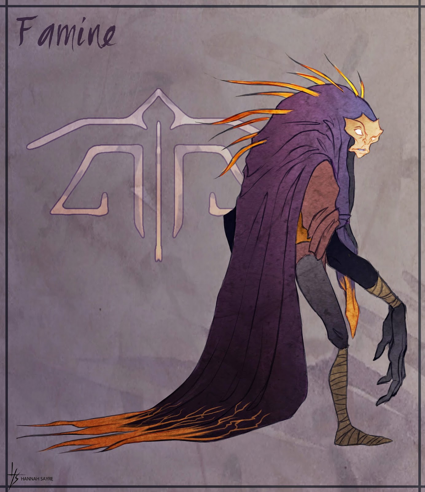
Next, the first of the two brothers: Famine. This guy I always wanted to be a creepy, unbalanced sort of character, so I incorporated the most asymmetry and exaggerated proportions into his design. He is associated with carnivorous plants, so I wanted his silhouette to read as vaguely predatory and menacing, but not overly so. From his early design the character also felt most appealing to me with these large, expressive hands. The Famine sigil design comes from the set of scales traditionally carried by the third horseman, Famine.

Lastly, the oldest of the siblings, Death. I imagined him as being the responsible oldest brother type, keeping everyone else in line, so for his design I used a lot of straight lines and squarish shapes. His was the hardest to fit thematically with a type of plant, but I ultimately found that gnarly old trees fit very well with him. Even rotted old stumps can become nurse logs, old wood will grow moss, etc, so there was this interesting life/death juxtaposition in old wood that appealed to me for the character. The color green, also, can be associated with both putrescence/decay and with life and growth, and I wanted to try to capture some of these dual associations in his design.
You can check out these concept illustrations over on my portfolio website, too! Again, I'll be posting the final images of the models as soon as I finish re-rendering them, and I'll post a bit more about the design process that went into this project later on as well.
Thanks for reading!
No comments:
Post a Comment